UX/UI Project
Notifications

+3M
Users impacted
48%
Center opening rate
6%
Conversion Rate
The Challenge
Core problem
The lack of a notification center forces users to hunt for information in different parts of the app or rely only on push notifications that can be easily missed. This creates a feeling of disorganization, frustration, and can lead to decreased app usage.
Ideation
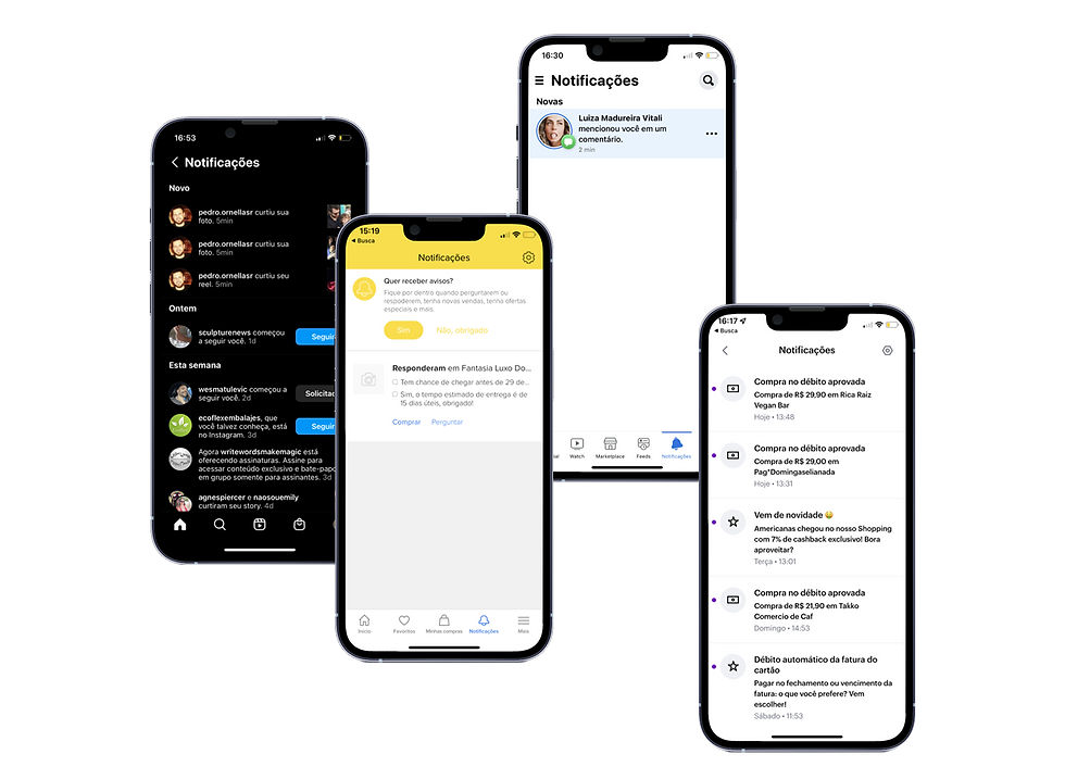
Benchmark
I performed extensive benchmarking, looking for some inspiration from leading companies in digital experience. Mercado Livre, Facebook, Instagram and Nubank emerged as key references due to their effective approaches,clean interface and the ease that the users have to clean or "mark as read" their notifications.

Developing the Notification Component
We already had a Button Notification component from our Design System. So, our first step was to complete its documentation and set up the rules for how notifications should work.

Key Decisions & Features:
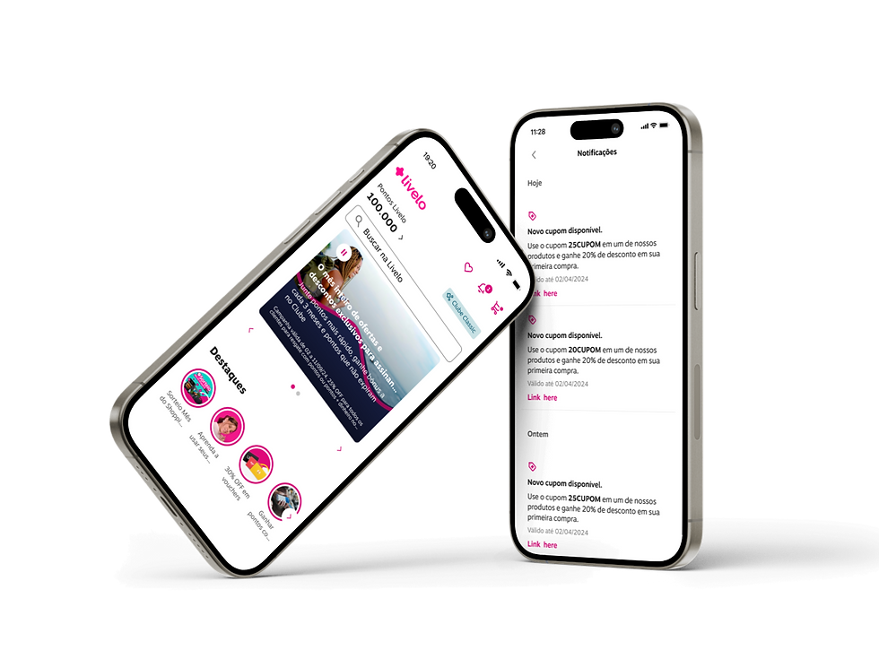
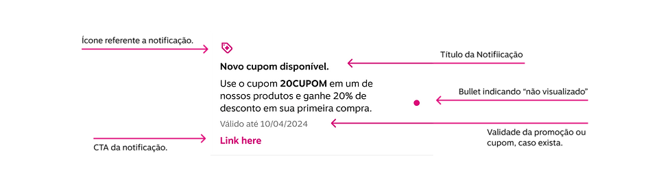
Working with the team and stakeholders, we decided on these parts for each notification (some are a must, some are optional):
-
Title
-
Notification text
-
Icon (for visuals)
-
Action button (optional)
-
Expiration date (optional)

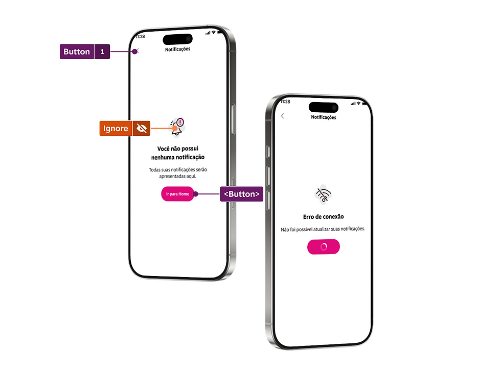
Screen States
Emtpy, loading, Conection error.
To make sure the user experience was smooth, we also thought about:
-
A loading screen: to show when the page is checking for new notifications.
-
"Empty state" screens: for when there are no notifications.
-
"Connection error" screens: for when there are network problems.
We also set up:
-
A section to show how many unread notifications there are.
-
A button to mark all notifications as read, with a message confirming it.
-
The order in which notifications appear.
-
How notifications would be saved in the backend.
-
Acessibility.

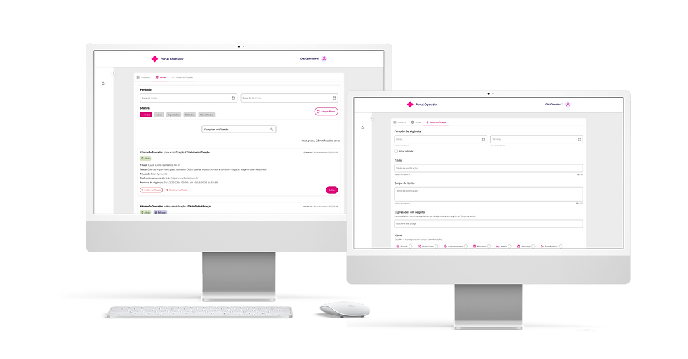
Operator Portal
To manage and scale our notification strategy, we developed a dedicated interface inside the Operator Portal.
This internal tool enables our operational and product teams to:
-
Create, edit, and delete notifications
-
Schedule messages to be sent at specific times
-
Apply targeting and segmentation rules to personalize notifications for different user groups
-
Automate flows, reducing manual efforts and supporting multiple products across the platform
This flexibility gave us the foundation to keep the Notification Center dynamic, scalable, and consistent with other communication channels in the app.
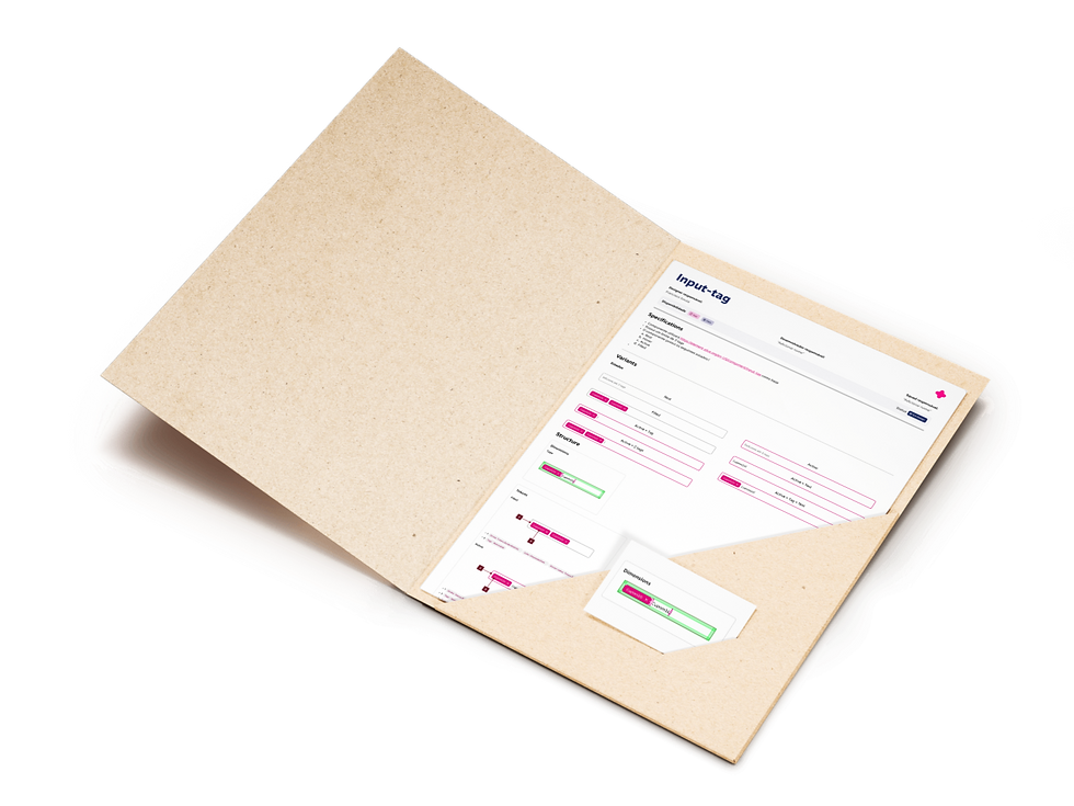
Input Tag Component
One of the technical requirements that emerged during the project was the need for an Input Tag component, something that was not yet part of our Design System.
This component was essential to allow content managers to add and remove multiple tags dynamically when creating a notification. We based its first implementation on the documentation from Element Plus Input Tag, adapting it to our system architecture and visual identity.
It also opened the door to future improvements and inclusion in the Design System library.

Benefits delivered
After launching the Notification Center, we observed a strong adoption from users and positive engagement metrics that validated our hypotheses:
First 6 months (Aug 6 to Feb 6):
-
2,236,563 users accessed the Central
-
53% opening rate
-
6% average conversion rate
Cumulative (Aug 6 to May 28):
-
3,061,227 users
-
48% opening rate
-
6% average conversion rate
These numbers confirmed the relevance and usability of a centralized place for notifications, improving the way we communicate with users across journeys — from campaigns and transactional messages to reminders and special offers.
In the end, having a Notification Center not only increased user satisfaction but also reduced dependency on push notifications and external channels. It marked an important step in the evolution of our in-app communication strategy, empowering teams internally while delivering more value to users.